
april 2026 things
+ an introduction

thank you for bearing with me as i decide on how i want to shape this newsletter. this page started by me sending an email upon graduation, inviting everyone to subscribe, with the promise that i’d post my thoughts to stay in touch. a few essays uploaded and taken down later, i knew i wanted to turn my newsletter into something meaningful, but i was stuck finding my voice.
i took some time to reflect. i knew i wanted to write about art and culture, about style and expression, and about how design and language shape the world we live in. but how, where to start, and why does it all matter?
there is something that iris murdoch wrote that I find myself often turning over in my head: “art and morals are… one. their essence is the same. the essence of both of them is love. love is the perception of individuals. love is the extremely difficult realisation that something other than oneself is real. love, and so art and morals, is the discovery of reality.” love and art are bound by acts of attention and noticing. art is a great teacher of love and how to love. it matters how we look at, represent and design the world because it demonstrates our capacity for love.
in the anthropocene reviewed: essays on a human-centered planet john green captures how the way we see is connected with how we love when he writes about what brings him and his wife together: “we did not spend our days gazing into each other’s eyes. we did that gazing when we made love or when one of us was in trouble, but most of the time our gazes met and entwined as they looked at a third thing. third things are essential to marriages, objects or practices or habits or arts or institutions or games or human beings that provide a site of joint rapture or contentment. each member of a couple is separate; the two come together in double attention.” our gaze matters because it is what connects us. how we communicate, share, and impress our gaze onto the world matters. it holds power. we can use it for worse or for better, to disconnect or connect, to bring or end suffering.

 Tiktok failed to load.
Enable 3rd party cookies or use another browser
green’s use of the term third things to describe sites of joint rapture, attention, and joy has interested me since i came across this quotation years ago. at the end of my yale education, i decided to take a poetry class. before the start of each class, our professor would ask us to go around the table and say one thing we noticed that week. it could be anything from the leaves beginning to grow back on trees in the springtime, a friend beginning to paint their nails a specific color, a tingling in the back of your throat, or an internal movement or sensation. i began to view what i was noticing as third things. as i acquired this habit of noticing, i noticed how love and appreciation for sounds, taste, smells, texture, and the shape of things grew. every sensation intensified. noticing ripened the fruits for poetry.
i’d like to treat this substack as a visual portfolio of third things. i plan to curate and write fragments about things that have stood out to me in the realm of art, design, literature and culture. in essence: a mind map of my creative consciousness. for my friends and loved ones, i hope you enjoy and stay connected. this is for you and our shared gaze.
one final announcement for my friends before i get into this april. after over a year off of instagram i am back on @ danimariethings. i’ve thought a lot about and practiced how to shift my relationship with social media as a tool for inspiration and connection. all in all, it seemed like a worthwhile step to take to put my work and experiences out there. and most of all to just have fun. feel free to connect!
✸
april finally brought in some much much needed sun. after a long uk winter, the sunshine has become a cherished third thing. one thing i admire most about the sun is its power to bring people together and lift spirits. i love seeing people sprawled out on patches of grass and drinking wine by the river. i love reading outside, taking breaks from the page to notice how the changing light has shifted the shade of the trees. i love how change no longer feels scary. it feels good, like hope.
louise glück’s poem “primavera” reminds us of this change. i like how the artist in this poem is called to the dirt to honor the sun. she knows that the rays of the of the sun are at odds with the darkness of the dirt. she doesn’t bother to sign her work, knowing that her need to mark the world is at odds with the nature of life’s impermanence. but it isn’t about making sense or longevity or certainty or the fear of another winter. it is about the world colliding into this moment of celebration.
this month i’ve spent a lot of time in museums and galleries thinking about how artists embody togetherness and collaboration, and how they celebrate change.
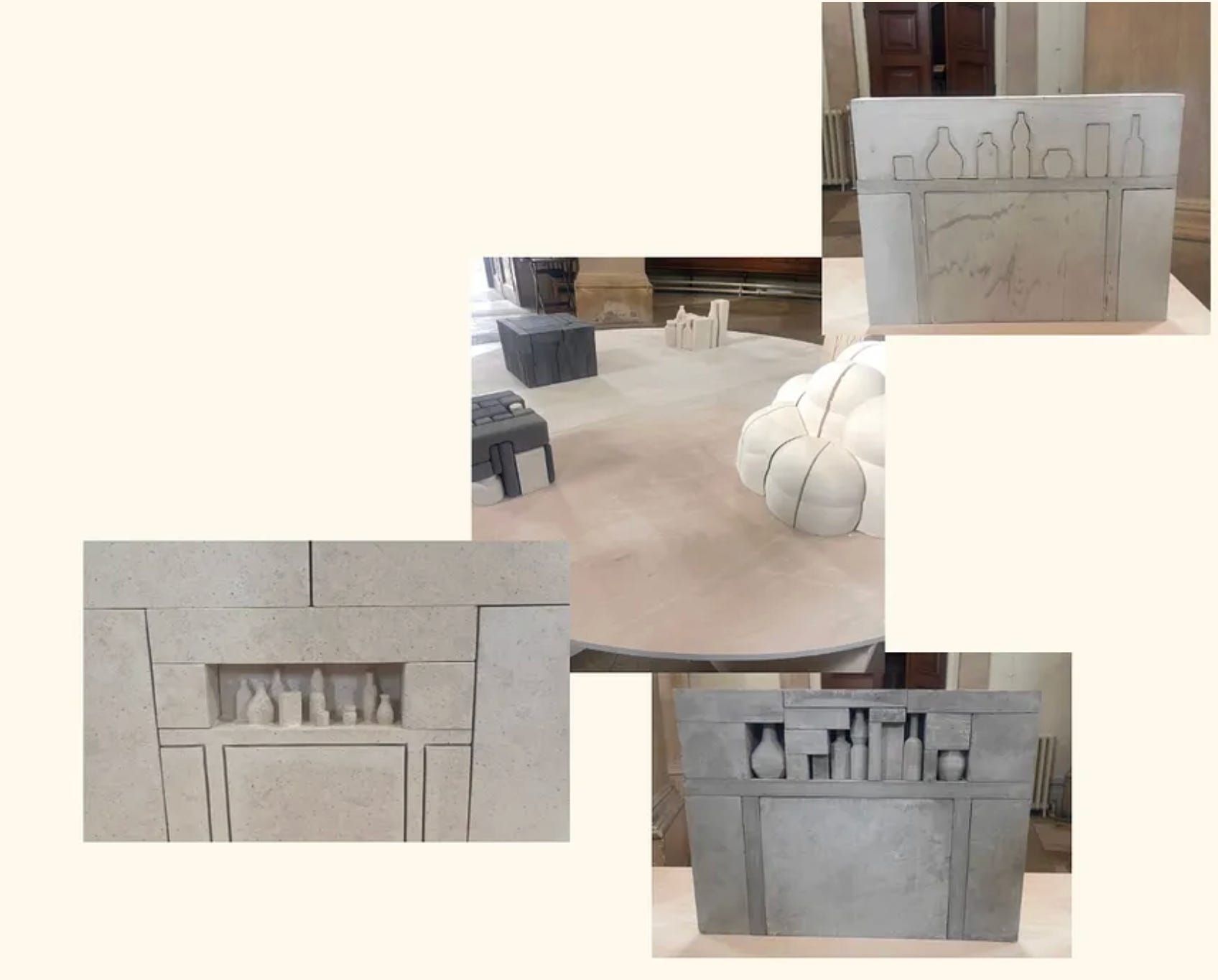
on easter sunday giorgia and i roamed around chelsea and found our way to brompton cemetery (which one might say was appropriate for the occasion). there, we encountered the work of the artist of gabriele risso in the cemetery chapel. the exhibition was entitled vita immobile, and was the artist’s first solo show. rossi’s sculptures are eloquent and compact. forms embody themselves singularly, but they also equally trap and expand themselves into a universe. the effect is carried through the way rossi places the sculpted or carved vessels into solid blocks that both seemingly depict and erase space. it is no surprise to me that risso takes inspiration from the artist giorgio morandi (1890 – 1964). the connection was my first thought upon seeing these sculptures. it also brought to mind jackson arn’s article about morandi’s paintings in the new yorker where he writes, “things are never just things. nobody would call morandi a christian artist, but you don’t have to strain to hear the spiritual whispers in his work—even in the early one-offs, he’s showing us the material world to suggest something else.” morandi’s still-life’s are suggestive of how object’s claim their presence in relationship to other objects. in his work the vessel’s compete with one another for representation. as arn mentions, “objects try to claim a seat and assert their full volume, and most of them do, but the loser (there’s always exactly one) is reduced to flat negative space, colored emptiness.” i find that for risso, the vessels compete with space itself. interlocked in a battle of acceptance and separation from it.
a few days later i took myself out on a solo date around hyde park.
i was very eager to see cecily brown’s picture making at the serpentine south. last month, i saw david hockney at the serpentine north, and was fascinated by his way of enacting change and memory in a digital tapestry of his time spent in normandy, paired beautifully with england’s gradual change in season. brown’s painting is placed in conversation with hockney. she revolutionizes the way we observe nature, even within a confined, controlled park as in kensington gardens, and challenges our memory of familiar subjects through spirited brushstrokes, repeated themes, and the entanglement of each element in her canvases.
what makes brown a brilliant painter is her attentiveness. it is the kind of attention many of us lose in our adult lives. walking through the gallery, i could sense her lantern consciousness. her acute awareness of everything in her sight animated by intense brushes of movement imbued with personality. she says, “i’m increasingly realising the way in which art helps you look at something that you wouldn’t want to look at in real life. it’s showing you this world that helps you understand the world itself, which is too overwhelming and too brutal. it’s a sort of in-between, surrogate world.”
one part of the exhibition i was drawn to was brown’s drawings that highlight her interest in children’s book illustrations. currently, i am illustrating a medical children’s book for a friend i had worked on a previous project with. when illustrating for children’s book one needs to think intentionally about communication. how will a child understand the image? how might a parent explain what is happening in the image? how can the image balance fantasy and playfulness while confronting reality? interestingly though, children are often better at intuiting what they see more than adults. they see the personality imbued in every fragment of life. brown’s vision contains this energy. it conflates fiction and reality and memory all at once. but it never leaves the viewer confused, instead it emmerses us fully into this world of intense looking that is deeper than representation – it is experience itself.
continuing my pursuit for warmth, jack and i ventured off to the south of france. we stayed in nîce and took the train to menton, monte-carlo, and antibes. the côte d’azur is a living incarnation of my favorite color palette. bright reds. earthy oranges. yellow ochre. touches of natural greens. deep browns. all pressed up against a pristine blue sky. days were spent seeking inspiration and flavor in outdoor farmer and vintage markets. we plunged into the meditteranean sea (essentially an ice bath to me – i’m more accustomed to warm atlantic waters), before lying on the rocky beach to read as the sun warmed our bodies.
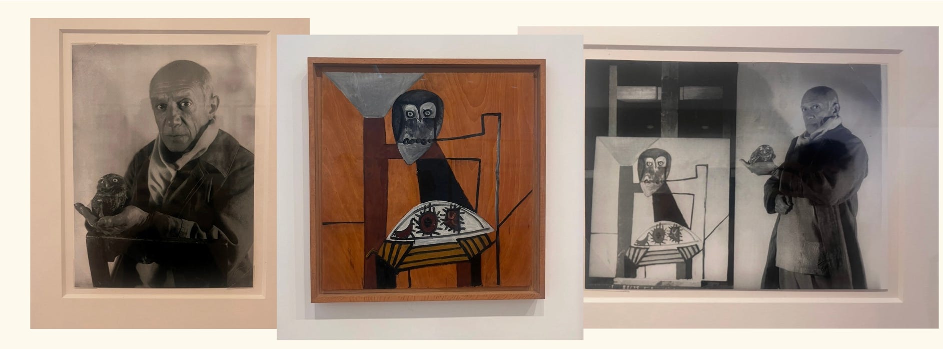
we also visted the picasso museum in antibes. something i consider when assessing a museum experience is how the museum matches the energy of its location. i was thoroughly impressed by the picasso museum’s warm character, whose design and curation portrayed an authentic picture of the côte d’azur through the artist’s eyes, and which he captured in his works during the time he spent there. the interior of the building itself, with its white painted walls and accented wooden beams, created an inviting space, and one that did not let you forget the proximity of the sea as natural light poured in through the windows allowing you to see the paintings with clarity. i’ve been to the picasso museum in paris and barcelona. each one gives you a unique angle with which to view his life and work. barcelona gives you a comprehensive, biographical trajectory of his work. paris focuses on his connection to the city and his artistic growth within it as he found refuge from war and acceptance there. but what i felt in antibes was picasso’s joy. the paintings on view showed his whimsy and playfulness. it portrayed picasso not as this isolated genius, but someone who worked with a spirit of collaboration and who was motivated by a spirit of exploration. his paintings had warm and bright color palettes, depicted mythical creatures, and experimented with form and structure. i walked away feeling like i could never have experienced these paintings outside of antibes.
when we got back, imaad invited us to a tour of phillip’s design auction.
the selection of pieces highlighted design’s ability to remain practical, in service of function, while remaining interesting. they allow the viewer to contemplate materials, construction, form, and color while maintaining integrity as everyday objects. in this way, like the sculptures of gabriele risso or the painting’s of giorgio morandi (mentioned earlier in this post), they both submit to their space but also assert their authority over it.
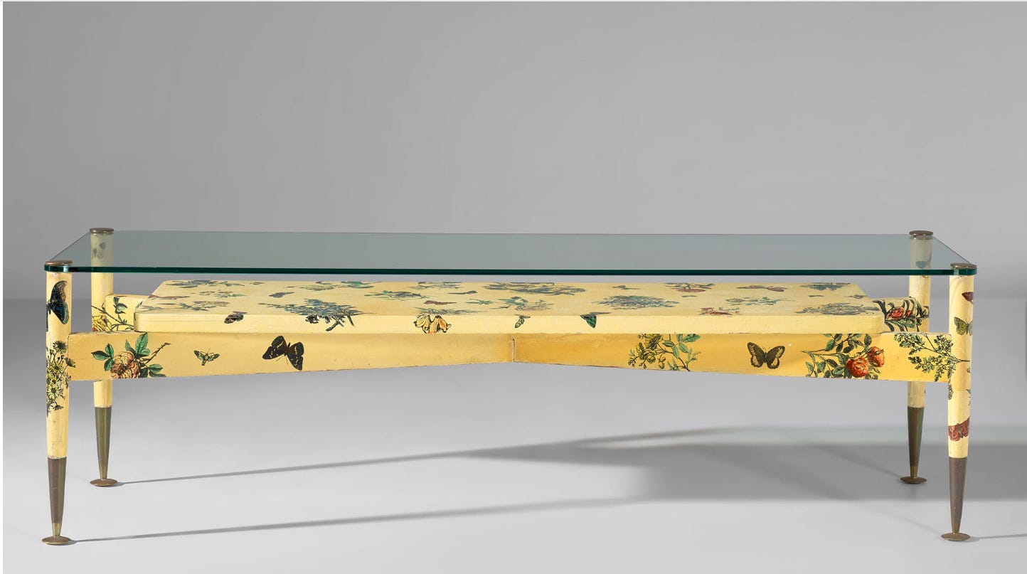
the first object i noticed was a low table by gio ponti and piero fornasetti. its the kind of object that you fall in love with and immediately want to place in your living room. the fiori e fartelle table is described as being part of a surreal ponti-fornasetti collaboration. butterflies and an arrangement of flowers are placed against a pale yellow background as a lithographic transfer printed onto the pieced. i love the crossbars that support the rectangle underneath the glass. it gives the piece the feeling of architecture and brings to mind associations between indoor and outdoor space.
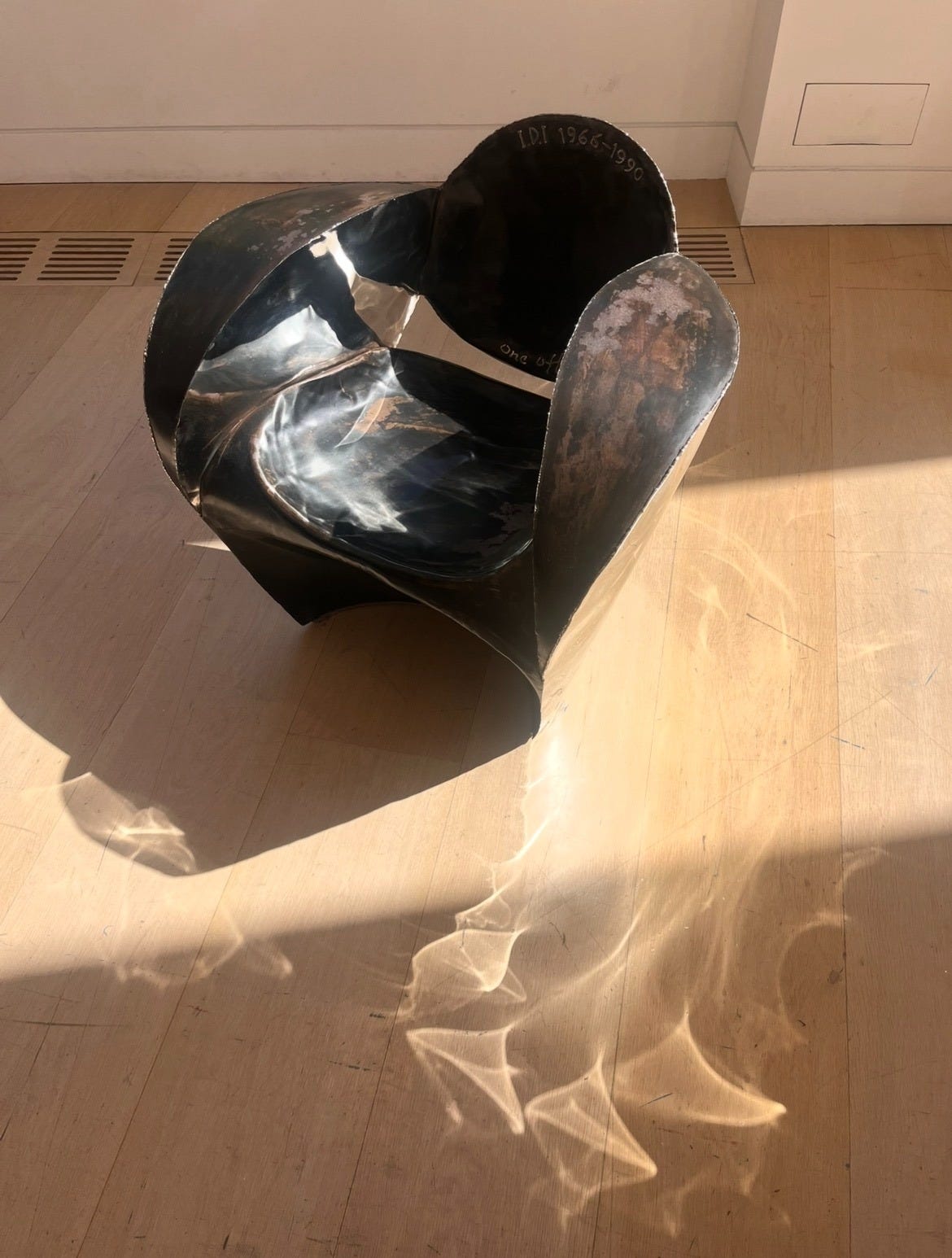
another highlight was an armchair by arm arad. two things i loved and noticed about this chair. first, was the working of the materials itself. unique armchair comes from arad’s experimentation with material in the 90s. he worked to develop a specific design language that is raw. where every accent and mark is punctuated. you can see the marks of heat and pressure and every weld. the effect is complete vulnerability. the metal is exposed. its story, the process, revealed. it made me think of a leather jacket that begins to take the shape of the wearer, molding itself to that person’s body and activity. what was once rigid becomes soft and malleable. it starts to tell a story. second, i like the light effect the chair leaves behind on the ground. it’s a unique light. light that could only be emitted from that chair. the light we share with the world can only be our own light.
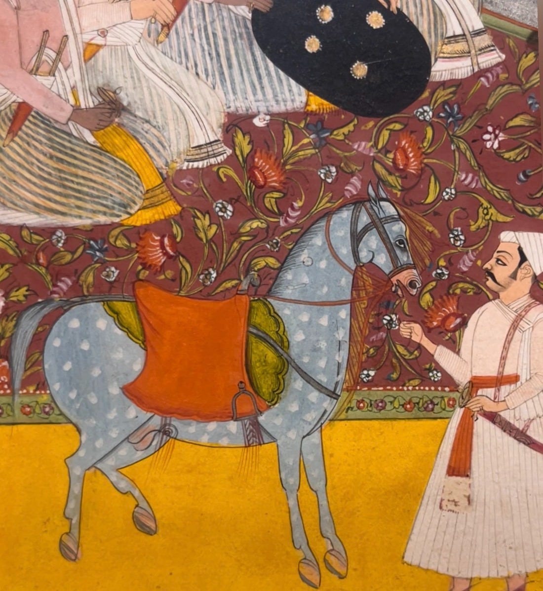
lastly, a close up of this painting from sotheby’s arts of the islamic world and india auction. it is simply the most beautiful horse.
logging off.
D.M.